popartblogdamonwright
Friday, April 1, 2016
test shots
These are some of the test shots we had for the project. Not all of them have been used because I did not have enough time. The picture came out good and it is a shame I didn't have time to use it. We did not change the ISO or anything like that because the camera was set up for us and there was no need to.
For this image I think that the image is too dark and it is not very clear. I think this is one of the reasons why I would not use this image.
I like this image because I think I could've made the colour look good. I also did an image of a black controller but I did not use either.
The problem with this image is that you can see both of our hands so it would be too hard to edit around and not really worth it.
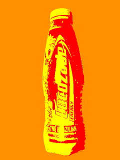
This was the image I used and it was the image I always wanted to use. I made it look like the Lucozade adverts.
Evaluation
 For this assignment we had to create a pop art image of something that is relevant today. I have decided to a picture of a Lucozade bottle. I have seen that they use pop art when they are advertising their product. We would use photoshop to edit the pictures to make them look like pop art images. I had no clue how to do this when we first started the project. We were going to use different lights like red heads. We would have to make sure that there were no shadows when taking the pictures otherwise it would ruin the picture.
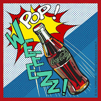
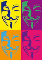
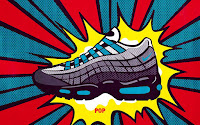
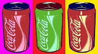
For the research I spent a lesson looking online at different pop art images. I took ten images from the internet so I knew the different styles of pop art. I also looked at when pop art stated and I found out that it first came around in the 1950's. The first two artists in Britain to help the movement of pop art were Eduardo Paolozzi and Richard Hamilton. I learned that pop art was made of bright colours and an image in front of the background that has had its colour changed to a bright colour. I looked at the Lucozade website and saw that they use pop art a lot when advertising. I think that this is because the bottles are usually brightly coloured and easy to see. When I saw the images it inspired me to make a picture of a Lucozade even though it has been done before.
I was not sure how many images I would edit but I took a lot of pictures however not all of them have been used. I brought in a Lucozade bottle from home. I also wanted to make a picture of a skateboard. I also had that prop on the day. I also wrote in the proposal about the health and safety with all the wires. I also wrote about the lighting saying that I would need to get it just right or the shadows would ruin the work. We were going to use different lighting like red heads. I also wrote that I would need to make sure the camera focuses on the prop and not the background.
 We only had one week to get all of the props that we needed. I managed to get a Lucozade bottle and the skateboard and Oskar brought in a lot of different props that we all used. We was not sure if we needed to book the cameras out or not. We also did not have much time do to everything we had to take the pictures and edit them in the same lesson. I think that we did well with the time we had. We found a room that was dark so that the light would not be an issue. For the planning I dd a proposal and I tried to stick to it as much as I could. I got the Lucozade bottle done and edited and I made sure the lighting was ok so that there was no shadows. However I did not need to use the red head light like I said I would in the proposal. I did get the picture of the skateboard however I didn't have time to edit it.
 We set up the camera so it was facing down onto the prop that did not change during every picture. We also had a light shining down on it and to the side so it didn't create a shadow. This worked so I wouldnt need to worry about it when editing the pictures. The bottle would not stay still when trying to take the picture of it. It would keep rolling off the table. I put something in front of it so it would not role however it would be in the way of the picture. So I got some bluetac and put it on the bottom of the bottle. We took the picture in the classroom next room. The camera was already set up when we took the picture so we didn't need to change the ISO or aperture. I took a lot of pictures however not all of them got used. We also had to use some bluetac on the pringels tub. I took a picture of the same image 3 times in case something went wrong.
 For the editing I had to take the pictures into photoshop. I would crop the image so that there wasn't that much background and that I could focus on the prop more. I also changed the background that was there to an orange colour. I then cut out around the bottle so there was no background from the original image. I then went into the settings of the image of the bottle. The effect I used for the bottle was vivid light to make it glow and look good. When this was put on the background I really liked what it looked like. I kept this image as my main image.
In some ways I kept to the proposal but in some ways I didn't because of the time issues. If I had more time I think that I would've done more. I did the pictures of what I wanted to in my proposal. I think that the image looks good. If I were to do this again I would try and spend more time editing the pictures. I have learned how to create pop art images in photoshop whereas I had no clue how to do it going into this assignment.
Proposal
For this project I want to take a picture of a lucozade bottle and a skateboard. I will need to make sure that the lighting is right for the picture and I need to make the camera focus on the props not the background. I also need to make sure there is no shadow because it will make it harder when I am editing the pictures. There will also be some wires on the floor so I would need to be careful when moving around the room. I have seen a lot of images on google of pop art and I have seen that Lucozade like to use pop art when they make adverts. I'm not sure what kind of colours I will use yet.
Friday, March 18, 2016
memory check
Q1
– Detail two reasons why we change the ISO
You can make a shorter shutter speed. It creates more detail.
Q2
– Explain the difference in depth of field between a wide and a
narrow apature
With a wide apature it would be a shallow depth of field and a narrow apature would be a deeper depth of field.
Q3
– List four consideration your had to take into account when producing your
pop-art photography. For example, depth of field, shadows etc)
When producing the pop art I had to make sure that there is no shadows. Be careful of the wires on the floor as the equipment is expensive. Make sure the camera is set at a reasonable angle. Focus on the prop and not the background.
Q4. Describe when would you choose to use the ‘A’ and
the ‘P’ modes on a camera
A= Apature It is used when controlling the depth of field.
P=Program It is easier when you want to do something quicker.
Friday, March 11, 2016
pop art research
Write 300 words
outlining the Pop-Art genre. Include the following points as headers:
• What was the time period?
• Where was it used? (detail an example)
• Who were some of the famous artists(name them)
• What are the features of a pop-art image?
• What constitutes a pop-art image?
• How do you think they were created?
• What/where could a pop-art image be used?
• What product could use a pop-art image in its advertising?
• What equipment do you think you will need? (list)
Pop art first came around in the mid 1950's for Britain and late 1950's for America. Britain used
pop art mostly after world war 2 and created parody pictures. Among the early artists that shaped
the pop art movement were Eduardo Paolozzi and Richard Hamilton in Britain, and Robert
Rauschenberg and Jasper Johns in the United States. The features of pop art is colourful and
bright pictures. It makes the eye catching and they always look good.
Lucozade is a company who uses pop art a lot in their adverts. Company's that have products
with bright colours usually work best with the pop art.
We will use red head lights in the studio for the lighting of the picture. I will need to find a good
background for it otherwise it could mess up the picture. I could use pretty much anything for my
prop for the shoot. I think I should use something bright because it will look better with the
bright background.
I will use a light facing down on the prop so there will be no shadow. This will make it a lot
easier when editing in photoshop.
Subscribe to:
Posts (Atom)


